
Tags:
The power of the Web is in its universality. Access by everyone regardless of disability is an essential aspect. Tim Berners-Lee
When Tim Berners-Lee opened the WWW to the general public in 1991 (previously it was internal to the CERN network) he had a vision that it would be of use by all, and that tenet is as true today as it was nearly 3 decades ago.
Back in the 90's, we had little in the way of assistive technology to help web browsing for those less able; we didn't even have a lot to offer in the way of standard browsers (Netscape and IE were the choices). Look around today, and there isn't a mainstream operating system or browser that doesn't have some kind of accessibility features. If anything though, there is as much difficulty now as there was in 1991. What we've gained in assistive technology, we've lost by creating incredibly complex web applications; applications that are veritable works of art, but that seem to almost deliberately make it difficult to be parsed by assistive programs.
What Does it Mean to Make a Website Accessible?
If you ask most web developers, making a website accessible means to make it work for blind people: add alt text to images, make sure the colours contrast, and call it a day. Laura Kalbag makes a good analogy about building accessibility not just being about wheelchair access in her article Why Bother with Accessibility?. While I think it's not a bad thing to add any kind of accessibility feature, it's not enough. At best it could be considered a naive effort, at worst it's a lazy one.
So what are the types of disability are there that can impact upon a persons web browsing?
Visual
- Low vision (in one or both eyes) can cause eye strain for longer periods. They may also have problems focusing on smaller text or tiny details within images
- Full blindness in one eye may result in a person not being able to focus for long (15-20 minutes) before their eyes become tired
- Full blindness in both eyes or extremely low vision may mean that a person cannot visually comprehend much (if anything) on the screen
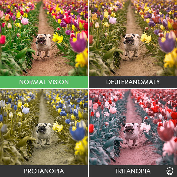
- Colour blindness can mean that parts of a website that use colour to convey meaning, or as a means of distinguishing details, are confusing. This can lead to some (or all) basic colours being discerned as grey, or as another colour close within the spectrum
Auditory
- Partial or full deafness may mean that a person is unable to hear any audio from sound or video clips on a web page.
Motor
- Problems such as RSI may make it difficult or impossible for a person to navigate using a mouse, so may rely on the keyboard only. Their speed of use may be affected as well, so navigation that depends on exact timing (e.g. double clicking) may be affected
- Disabilities such as Parkinsons may make it difficult to easily click a mouse and keep it still, accidentally causing dragging movements
- Things such as Motor Neurone Disease may make it extremely difficult to use conventional mice and keyboards and may be using alternative pointing or navigation methods
- Loss of limbs can mean that conventional computer peripherals are impossible to use
Cognitive
- Learning difficulties such as ADHD can affect attention spans for some people, making it difficult to consume lengthy content. Pages that appear too busy (cluttered, or with lots of animations) can negatively affect their attention
- Some disabilities make it difficult to understand complicated words or sentences. A Flesch reading ease of score below 60 for web content may impact a persons ability to read and understand content
- Some learning difficulties (like Dyslexia) can be helped using colour overlays which will affect colour schemes of a website, so again colour contrast can be important here
- Various cognitive disabilities affect memory negatively, so websites which rely too heavily on a person remembering where they are within a user journey can be daunting
- Large variations from normal website behaviour (e.g. right-hand navigation) may have an impact on people with learning problems (such as some forms of Autism), as it goes against what they've learned as a pattern
Age
Age is a pseudo-disability, which can include one or more of the aforementioned issues. but particularly they can also suffer from:
- Reduced vision and loss of colour perception
- Loss of hearing and discerning individual sounds within a "busy" audio stream
- Reduced motor control, difficulty moving, difficulty staying still (tremors, jitters), loss of finer motor control
- Shorter short-term memory, less ability to learn new or unfamiliar processes, and shorter concentration levels
With life expenctencies increasing year on year, the potential audience for your website will likely be getting older as well. This will mean more users with age-related issues visiting your site, so accessibility is essential.
Specific Problems Users Have on Websites and How to Overcome Them
These disabilities can lead on to a huge array of problems with website usage. Depending on what disability/disabilities a user has, they may have encountered one or more of these problems. Note that this isn't a complete list, and that there may be other issues which are not fully covered here. Almost all of these problems can be prevented, or greatly lessened if you develop with a little consideration towards peoples disabilities. It's also incredibly important to remember that users may not suffer from just one problem. As is particularly evident with age-related disabilities, a person may have multiple problems that can affect their browsing capabilities and behaviour.
Users should be able to easily determine where they are, across all levels.
This relates to issues with memory, and attention span. Being able to easily identify where you are at all times is important for these users.
- Breadcrumbs, clear navigation areas, and sensible URLs help identify where a user is within a website
- Clear focus styles for all focusable elements of a page, including links, form elements, and other interactive controls
- Focus should move naturally with the content, e.g. modals should capture focus when initially displayed, return focus when closed, and not allow a user to tab out to other parts of the page while the modal is still active
- User journeys that require a lot of steps (e.g. a complex payment form) should have logical blocks. Can a user easily identify where they are within a given journey?
Navigation should be possible using a variety of methods; users may not be using a mouse or keyboard
A user may not be able to use a mouse or other pointing device, so navigation throughout the site should be available via other methods. Generally if a site is fully navigable via keyboard, it's a good indication that it's accessible. It's worth noting though that this alone does not guarantee accessibility.
- Can all key navigational elements on the page be accessed with only a keyboard?
- Can elements be navigated slowly, or do things like drop-down menus disappear after set time limits?
- Do interactive elements have large enough hit areas for someone with poor motor control? This includes things like resize handles on custom objects
- Do interactive elements have a large enough perceived hit area?
- Are elements native HTML elements or are they stylised custom elements that rely heavily on JavaScript to function? Native elements are always more accessible.
- Links should be self explanatory when taken out of context. Links should not just say "click here"
- Links should also avoid containing the full URL within, as these may be read out by screen readers. Imagine a page full of URLs being read out one after the other!
- Do interactive elements have different focus and hover styles? Users may not be using a pointing device so focus styles are essential to inform them where they are withing the page. Hover styles should differ to allow users with a pointing device to identify what they are currently interacting with even if it has focus
Colours should not be used to convey meaning
There are many kinds of colour blindness, which can make it extremely hard or impossible to distinguish elements on a page. Try converting the entire colour scheme to grey; do all parts of the site still make sense, or are there parts which no longer make sense without the colour information. Consider using different shapes instead to communicate, and allow enough colour contrast for things to stand out well.
- Do element colours have enough contrast with the background upon which they sit?
- Do things like checkboxes use some kind of indicator other than colour to show when they are checked?
- Do links stand out in some way other than colour, or does that colour contain enough contrast against the main text colour?
- Are hover and focus effects clear enough without any colour?
- The colours you have chosen may not be the colours the user is seeing. ADHD sufferers have been shown to have improved concentration levels when using coloured filters over text, so they may be using browser plugins which give apply a colour filter to the screen. What does your site look like under different colour filters?
Content that is of a particularly visual nature should have additional textual content that can be rendered by assistive technologies
Some users may not be able to see at all, and will be relying on other means of "seeing" your website. Anything that is visual-only should allow for this and have additional markup to aid visually impaired users.
- Images that convey information (simple charts, stylised text, etc) should have
alttext (all images should havealttext, even if empty). Try to avoid text that reads "image of…"; the visitor already knows it's an image, this is conveyed to them through whatever assistive tech is being used. - Images that are not important to the content should become background images where possible
- Videos should have captioning to accompany any dialogue
- Content should still make sense after all visual elements (CSS, presentational images) are removed and informational images replaced with their text counterparts
- Does the flow of content make sense, or was the HTML laid out for visual users only? Turn off the stylesheets and see if the content is in a logical order
- Are important parts of the page still available or was JavaScript or CSS responsible for inserting them? Typically, content added via CSS's
contentproperty is not read out by assistive tech. Javascript has better support, but depending on what it's doing, the content may never be "seen" by screen readers, etc. - Is there a logical structure of headings within the page, or are the headings for visual effect only? Headings should be nested correctly, starting with
<h1>and moving down. Avoid using<div>tags styled to look like headings, as these are not seen as headings by screen readers. - Text entered all in uppercase can cause issues with older screen readers, which may read it out as if it were a bunch of acronyms. If you're only making it uppercase for visual effect, use CSS instead.
- Do complex images like graphs have alternative equivalents, like a longdesc pointing to an explanatory page, or an accessible table that conveys the same data?
Audio content should have accompanying visual aids, e.g. audio captions
This is less of a problem for the majority of websites, but still an issue if you're using audio for anything, which includes the audio tracks on videos. Try to provide captions for audio tracks, or a link to alternative pages describing the content.
- If you have audio, try to keep it simple, and avoid talking over other background noises in the tracks, or lower the background decibel level, to make it easier for someone hard of hearing to clearly understand what is happening
- Avoid audio tracks that are only in one channel of stereo, as a user may not have full hearing in both ears. Where possible, ensure that the important part of an audio stream is distributed evenly across left and right channels.

Content should be as simple as possible without sacrificing purpose
Some users suffer from short term memory issues, and some may have learning difficulties, which can make it hard to process complicated pages with too much content (both visual and audible content). ADHD and epilepsy sufferers can mean that people cannot easily use websites that are full of animations.
- Try to simplify or clear up busy-looking pages, users can become distracted by too much happening (for example arngren.net.)
- Avoid too much animation across the page or in videos if it's not necessary, this can easily distract users
- Audio should be clear as possible to hear, try not to overlap multiple audio streams (e.g. a person talking over a song)
- Think about the terminology and general vocabulary used, can it be made easier to understand while still conveying the same meaning? What about Flesch reading ease score?
- Are forms clear and easy to use?
- Do forms describe their purpose properly? Think about small single-field forms, like those used for site search. Is it obvious what it is for without images, etc?
- Do all form fields have a corresponding label? Labels help indicate what a field actually is. The
placeholderorvalueattributes should not be used for this. - Are the correct types used for each field? For example, using number fields helps mobile phone users input numbers as it changes the keyboard.
- Are forms broken down into manageable chunks? Large forms can be overwhelming to people with a lower concentration span, so consider breaking them into several smaller forms presented to the user as a series of steps.
User journeys should be intuitive
Users may be older or suffer from learning disabilities, which may mean they find it harder to learn new concepts, or understand what they should do.
- Use familiar concepts where possible, some users may find it difficult to learn new nagivation methods or new ways of interacting with things
- Keep a consistent style across the site to reinforce basic ideas: links, buttons, form elements, etc, should be easily identifiable through their styles
- Users should be able to understand what their options are within any given part of your site
- Sentences in all caps can be harder to read for most people, but more so for people with some cognitive disabilities
What Can You Do?
You might be saying to yourself right now that this seems like an awful lot to remember, and you'd be right. That doesn't mean you should just give up in the face of a daunting task. In the same way that you learned to write good, clean code over time, bit by bit, you can learn how to make your websites accessible too. Pick a page of your site, and run through some basic tests:
- Do colours contrast?
- Can I navigate with keyboard
- If I disable styles and images, does the site still work?
These should give you a basis for improving other, more complicated aspects of your site. By approaching the effort in manageable chunks, you can more easily fit it into your typical development time with little overhead.
Also, if you can, try to get real people with real issues testing your work, get some feedback from the people you're trying to help. This can also help highlight more specific areas that you can focus your time on, which can be very helpful if you're trying to improve on a legacy codebase.
As developers, we have a duty to ensure our work is good and meets standards that we set. Accessibility efforts should become part of your quality standards. If you work as part of a team, get all members on-board and aware of what kinds of things need to be done, and question each other on code peer reviews. If you work alone, then reach out to other developers in the community, and read from some of the many great resources out there, like Marco Zehe's Accessibility Blog and the WAI-ARIA basics guide.
Embrace Tim Berners-Lee's ideal of an accessible web. He believed that everyone should be able to access it, and you should too.
Comments