Tags:
Playing around with CSS to create single <div> works of art is, while largely useless for production-worthy code, a lot of fun, especially to see how far a technique can be pushed. In the past I've created CSS Animals and even an animated BB8.
Contents
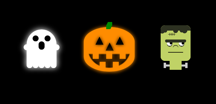
Here, I've played around with various ways to build a few fun Halloween-inspired art pieces.
Ghost
The first one I attempted was a ghost, with a heavy use of box-shadow to create the details.
The basic shape is a box with rounded corners on the top. Next, I added a circle (basic square with border-radius: 50%) using a pseudo element for the left hand. From there, the eyes, right hand, trails, and even the mouth is drawn with a series of box shadows on the pseudo element using a 0px spread:
box-shadow:
	100px 0 0 #fff,

	10px 60px 0 #fff,
	30px 60px 0 #fff,
	50px 60px 0 #fff,
	70px 60px 0 #fff,
	90px 60px 0 #fff,

	30px -30px 0 #000,
	70px -30px 0 #000,

	50px -10px 0 #000,
	50px -8px 0 #000,
	50px -6px 0 #000,
	50px -4px 0 #000,
	50px -2px 0 #000
;
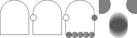
In order from top to bottom are the right arm, the bottom trails, the two eyes, and then the mouth as 5 consecutive shadows with a 2px difference in position between each one.
To give the ghost a nice spooky effect, I repeated each trail and arm as another shadow but this time with a 20px spread. On the black background this gives the impression of a ghostly glow.
To finish the whole thing off, I used a simple CSS animation to give him a hover effect:
animation-direction: alternate;
animation-duration: 1.5s;
animation-iteration-count: infinite;
animation-name: hover;

@keyframes hover {
	from {
		top: 10px;
	}
	to {
		top: 30px;
	}
}
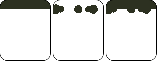
Gravestone
A Halloween house isn't complete without a gravestone or two outside the front, So I thought it would be nice to create one in CSS. Now, while this is technically still just a single <div>, there is text within the HTML. I know purists will declare this isn't allowed, but I think it's fine to bend the rules slightly for this.
This mostly makes use of basic font techniques, custom fonts, and characters from the extended character sets. The HTML (look away now purists!):
<meta charset="UTF-8"/>
<link href="https://fonts.googleapis.com/css?family=UnifrakturMaguntia" rel="stylesheet">
<link href="https://fonts.googleapis.com/css?family=Cinzel+Decorative" rel="stylesheet">

<div class="gravestone">Here lies Flash, choked on an Apple</div>
To get the nice rounded shape at the top, I used the long format of the border-radius property, which allows you to set both control points of the arc:
border-radius: 50% 50% 0 0 / 30% 30% 0 0;
I wanted the cross and "RIP" part to be in a slightly different font, so that had to be content added through a :before element. This also uses the ♱ symbol (or the East Syriac Cross) from the Miscellaneous Symbols block of characters (where you'll find common weather and Zodiac symbols). It's common enough and most systems should have a font capable of displaying it.
As a little flourish, I wanted a small bouquet of flowers at the base of the stone. Handily, there's the 🎕 character which is named just that. One thing I did notice about this is that the display of it differs across base fonts installed on various systems. It shouldn't matter for this though, mostly it's just the glyph orientation that changes.
.gravestone:before {
	content: "♱  RIP";
	display: block;
	font-family: 'Cinzel Decorative', cursive;
	font-size: 38px;
	font-weight: bold;
	line-height: 120%;
	margin-left: 15px;
	position: absolute;
	top: 20px;
	width: 80px;
}
.gravestone:after {
	color: #500;
	content: "🎕";
	display: block;
	font-size: 35px;
	left: 100px;
	position: absolute;
	top: 190px;
	width: 110px;
}
One important thing to note is that you must indicate to the browser the correct character set you're using for the content, or those symbols will not display. This is done through either a HTTP header if you're serving this via a web server, or using a <meta> tag as I've done above.
To finish things off, I added a spooky murky glow behind the gravestone using a simple animation between 1 shadow and 3.
.gravestone {
	animation-direction: alternate;
	animation-duration: 2s;
	animation-iteration-count: infinite;
	animation-name: glow;
}

@keyframes glow {
	from {
		box-shadow: 0 0 10px #080;
	}
	to {
		box-shadow:
			0 -5px 40px rgba(0, 128, 0, .5),
			-5px -5px 40px rgba(0, 128, 0, .5),
			5px -5px 40px rgba(0, 128, 0, .5);
	}
}
Pumpkin
The pumpkin I found a little tricky initially, as I quickly found myself running out of elements for the full effect.
Again, I used the long form of border-radius to get a nice shape:
border-radius: 60% / 40%;
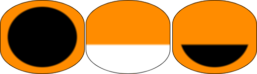
The major challenge here was the mouth, as I effectively needed a half semicircle, but I didn't want to use up one of my precious pseudo elements. To achieve this, I used an old trick which relies on stacking background gradients:
background-image:
	linear-gradient(#ff8c00, #ff8c00 59%, transparent 62%),
	radial-gradient(#000, #000 57%, #ff8c00 60%);
When the browser draws background gradients like this, it applies them in order from last to first. It's important to remember this as the stacking order is vital.
First, I give my pumpkin shape a black circle in the center, and the rest in orange. On top of that is a linear gradient, which draws a block of orange from the top down, then stops and draws transparent for the rest. It's this transparency which allows the radial gradient to show through, and gives the semicircle I was after.
Next, I did the stalk (I wasn't finished with the mouth, but the stalk needed to come first), which is basically just a block with a diagonal linear gradient using a mix of transparency and hard steps to give it an oblique appearance. It's a little crude, and I'm sure I could tidy it a little with more gradient layers over the top, but it works well:
background-image:
	height: 25px;
	linear-gradient(
		115deg,
		transparent 18%,
		#080 20%,
		#080 80%,
		transparent 82%
	);
	width: 20px;
What this did give me though was a nice rectangle block that I could use for as many box-shadows as I wanted; excellent pumpkin teeth!:
box-shadow:
	-45px 100px 0 #ff8c00,
	0 100px 0 #ff8c00,
	45px 100px 0 #ff8c00,
	-22px 135px 0 #ff8c00,
	22px 135px 0 #ff8c00,
;
The last part was the eyes and nose. Borrowing from the earlier gravestone methods, I used a triangle from the Geometric Shapes block and replicated this back out with more box-shadows:
.pumpkin:before {
	content: "▲";
	display: block;
	font-size: 35px;
	left: 73px;
	position: absolute;
	text-shadow:
		0 0 10px #000,
		34px -20px 0 #000,
		34px -20px 10px #000,
		-34px -20px 0 #000,
		-34px -20px 10px #000
		;
	top: 42px;
}
As before, ensure you either set the right character set headers or add the right <meta> tag or the triangle won't work. This is because it's a multibyte character, so a browser needs to understand how to handle it.
Finally, I added a glow animation to give the effect of a glowing Jack-o-lantern:
@keyframes glow {
	from {
		box-shadow: 0 0 10px #ff8c00;
	}
	to {
		box-shadow: 0 0 60px rgba(255, 255, 255, .5), 0 0 60px #ff8c00;
	}
}
Frankenstein's Monster
This one took a lot more work with gradients, and surprisingly uses only 1 pseudo element despite being the most visually complex piece here.
The Head
The first part on his face is the scar, which is created with 3 linear gradients:
linear-gradient(#c0d266, #c0d266 22%, transparent 22%, transparent 29%, #c0d266 29%),
linear-gradient(90deg, #c0d266, #c0d266 25%, transparent 25%, transparent 30%, #000 30%, #000 31%,
	transparent 31%, transparent 35%, #000 35%, #000 36%, transparent 36%, transparent 40%, #000 40%,
	#000 41%, transparent 41%, transparent 45%, #000 45%, #000 46%, transparent 46%, #c0d266 52%),
linear-gradient(transparent, transparent 25%, #000 25%, #000 26%, transparent 26%)
The last line of this creates a single line a quarter of the way down the main head block, and the second then creates a series of 4 lines that cross it and run all the way down from top to bottom. That line also hides part of the first line as we only want a small scar. Finally, the first line (remember, gradients are stacked on top of each other from last to first) cuts off the vertical lines by drawing a green block above and below the scar.
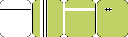
The mouth is similar, but only uses 2 layers of gradients to buid one thick line that spans half the width of the face.
linear-gradient(90deg, #c0d266, #c0d266 25%, transparent 25%, transparent 75%, #c0d266 75%),
linear-gradient(transparent, transparent 75%, #000 75%, #000 77%, transparent 77%),
Next up are the eyes, using a total of 6 radial gradients:
radial-gradient(circle at 30% 50%, #000, #000 5%, transparent 5%),
radial-gradient(circle at 30% 50%, #fff, #fff 10%, transparent 10%),
radial-gradient(circle at 30% 52%, #2d3121, #2d3121 10%, transparent 10%),
radial-gradient(circle at 70% 50%, #000, #000 5%, transparent 5%),
radial-gradient(circle at 70% 50%, #fff, #fff 10%, transparent 10%),
radial-gradient(circle at 70% 52%, #2d3121, #2d3121 10%, transparent 10%),
I could have simplified this slightly and used only 4, but then I would have lost the animation on the pupils; not something I wanted to sacrifice for cutting out 2 lines of code! The dark rings beneath each eye are just a darker circle (made with a gradient, of course) slightly offset from the ones that create the eye.
radial-gradient(circle at 20% 44%, #2d3121, #2d3121 5%, transparent 5%),
radial-gradient(circle at 80% 44%, #2d3121, #2d3121 5%, transparent 5%),
linear-gradient(90deg, #c0d266, #c0d266 20%, transparent 20%, transparent 80%, #c0d266 80%),
linear-gradient(transparent, transparent 40%, #2d3121 40%, #2d3121 48%, transparent 48%),
Here again the line technique above has been used for the eyebrows, but this time each end has been 'capped' with a radial gradient to give them a softer edge and avoid the whole thing looking too blocky.
The hair is next, and just uses one gradient from the top that draws a small dark green block, and topped with a series of radial gradient circles.
linear-gradient(#2d3121, #2d3121 15%, transparent 15%),
radial-gradient(circle at 5% 15%, #2d3121, #2d3121 7%, transparent 7%),
radial-gradient(circle at 15% 15%, #2d3121, #2d3121 5%, transparent 5%),
radial-gradient(circle at 50% 15%, #2d3121, #2d3121 7%, transparent 7%),
radial-gradient(circle at 80% 15%, #2d3121, #2d3121 7%, transparent 7%),
radial-gradient(circle at 70% 15%, #2d3121, #2d3121 5%, transparent 5%),
The very last thing on the main head block is the nose, which just uses the reverse direction of the technique used to draw the dark eye rings.
radial-gradient(circle at 50% 65%, #c0d266, #c0d266 10%, transparent 10%),
radial-gradient(circle at 50% 63%, #2d3121, #2d3121 10%, transparent 10%),
The Neck
This was about as far as I could push the head block, and my attempts to have the neck and bar as part of this also drawn with gradients on the same <div> resulted in a square head at the bottom, which looked awful. Instead, I opted to use my :before element. Only 4 gradients are used here:
- 4. The fourth draws the ends of the bolts, created as 2 vertical grey blocks on the left and right
- 3. The third draws a black line over these at the top and bottom, so that the grey boxes don't span the full height of the pseudo element
- 2. The second gradient draws a grey bar which spans the width of the element
- 1. And lastly, the first gradient draws a green block in the middle to act as the neck of the monster
Animating the Eyes
As a finishing touch, I decided to animate the pupils of the eyes by alterin the background-position property. This is why I kept the pupils as separate gradients earlier, in order to act on their layer individually.
First, I set up the default background positions for all layers in the head:
background-position:
	0 0, 0 0,
	0 0, 0 0, 0 0, 0 0, 0 0, 0 0,
	0 0, 0 0, 0 0, 0 0,
	0 0, 0 0, 0 0, 0 0, 0 0, 0 0,
	0 0, 0 0,
	0 0, 0 0, 0 0
;
Then, I set up a repeating alternating animation using 3 fixed points to animate between:
@keyframes eyes {
	0% {
		background-position:
			0 0, 0 0,
			0 0, 0 0, 0 0, 0 0, 0 0, 0 0,
			0 0, 0 0, 0 0, 0 0,
			-5px 0, 0 0, 0 0, -5px 0, 0 0, 0 0,
			0 0, 0 0,
			0 0, 0 0, 0 0
			;
	}
	50% {
		background-position:
			0 0, 0 0,
			0 0, 0 0, 0 0, 0 0, 0 0, 0 0,
			0 0, 0 0, 0 0, 0 0,
			0 5px, 0 0, 0 0, 0 5px, 0 0, 0 0,
			0 0, 0 0,
			0 0, 0 0, 0 0
			;
	}
	100% {
		background-position:
			0 0, 0 0,
			0 0, 0 0, 0 0, 0 0, 0 0, 0 0,
			0 0, 0 0, 0 0, 0 0,
			5px 0, 0 0, 0 0, 5px 0, 0 0, 0 0,
			0 0, 0 0,
			0 0, 0 0, 0 0
			;
	}
}
Conclusion
I've said it before, CSS can do some amazing things. Whether you should take it this far on your production site is another question, and I'd probably say "no" most of the time. However, there are a lot of simple techniques here that can be used effectively across your websites.
So if you're looking at doing these single div pieces of art yourself, I'd recommend getting to know how the CSS gradients work, and take a look at the things you can do with box-shadow. These two tools are your best friends, and incredibly powerful.
Happy Halloween! 👻👿💀
Comments