Tags:
The new selectors in CSS3 are very powerful, and allow for some interesting ways of creating interactivity on a website that doesn't rely on JavaScript. Typically, a lot of these new techniques are available in the majority of web browsers being used with the obvious exception of IE up tp and including 8, which limits their usefulness when compared with current JavaScript solutions, but that shouldn't detract from the other advantages.
One of the new selectors is the one used to style selected checkboxes and radio buttons, :checked. As well as using this to style input elements themselves, we can also target elements around them, which is the trick I'm going to be using here.
I'm basing the basic styles of this tree off of some work I did a while back with styling nested lists. The HTML will remain largely the same, but with a few additions:
<ul>
	<li><label><input type="radio" name="level_1"/>Directory 1
		<ul>
			<li>Directory 1.1</li>
			<li>Directory 1.2</li>
			<li>Directory 1.3</li>
		</ul></label>
	</li>
	<li><label><input type="radio" name="level_1"/>Directory 2
		<ul>
			<li>Directory 2.1</li>
			<li>Directory 2.2</li>
		</ul></label>
	</li>
	<li><label><input type="radio" name="level_1"/>Directory 3
		<ul>
			<li><label><input type="radio" name="level_2"/>Directory 3.1</label></li>
			<li><label><input type="radio" name="level_2"/>Directory 3.2
				<ul>
					<li>Directory 3.2.1</li>
					<li>Directory 3.2.2</li>
					<li>Directory 3.2.3</li>
				</ul></label>
			</li>
			<li><label><input type="radio" name="level_2"/>Directory 3.3
				<ul>
					<li>Directory 3.3.1</li>
					<li>Directory 3.3.2</li>
				</ul></label>
			</li>
		</ul></label>
	</li>
	<li><label><input type="radio" name="level_1"/>Directory 4
		<ul>
			<li>Directory 4.1</li>
			<li>Directory 4.2</li>
		</ul></label>
	</li>
</ul>
As you can see, from the original I've added some radio buttons and labels. The HTML isn't quite compliant, but it do trick by giving us large areas we can use to interact with the radio buttons, which is important as we'll be hiding them later with CSS. The full CSS code is below:
ul
{
	padding-left: 0px;
}
li
{
	list-style-image: url('folder.png');
	list-style-position: inside;
}
ul ul li
{
	list-style-image: url('folder-blue.png');
}
ul ul ul li
{
	list-style-image: url('folder-green.png');
}

ul ul
{
	padding-left: 30px;

	position: absolute;
	max-height: 0px;
	opacity: 0;
	z-index: -1;
	-webkit-transition: max-height 2s ease;
	-moz-transition: max-height 2s ease;
	transition: max-height 2s ease;
}
ul input[type=radio]
{
	display: none;
}
ul input[type=radio]:checked + ul
{
	position: static;
	max-height: 300px;
	opacity: 1;
}
The new CSS starts from line 23 inside the ul ul selector. The reason for the absolute positioning, opacity and max-height is to allow the showing of the sub-menu to be animated with CSS, as a transition can't happen when using display: none;.
The key part to this is the last selector which matches all ul tags that immediately follow radio buttons that are checked, and sets their height, position type, and opacity.
The final result isn't as good as a JavaScript solution, once a menu is toggled on it can't be toggled off. This is because of the way the radio buttons work. Changing the radio buttons to checkboxes would fix this, but then it would also allow multiple trees to be open at once. If that's something you can live with then use it.
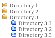
Here it is in action:
Comments