Tags:
I recently saw a Pen on CodePen with an animated menu using blend modes. The overall effect was quite nice, but I noticed it was relying on JavaScript to toggle the animation, and as an example it wasn't particularly flexible, as those values were tied into the 5 items shown.
I set about recreating the effect but with pure CSS, and took it a little further using some SASS to allow it to a varying number of menu items.
The first step was getting the HTML in place, using the opportunity to make it a little more semantic, and add in the key element that would let me do this without any JavaScript:
<nav href="" class="menu menu-main">
		<input type="checkbox" id="menu-main"/>

		<a href="#" class="menu-item item-1">home</a>
		<a href="#" class="menu-item item-2">docs</a>
		<a href="#" class="menu-item item-3">photos</a>
		<a href="#" class="menu-item item-4">music</a>
		<a href="#" class="menu-item item-5">videos</a>

		<label for="menu-main" class="menu-item menu-label">Menu</label>
	</nav>
The label element links up with the checkbox, which appears before everything else. This is so that CSS can select the menu items based on the checked status of the checkbox.
From there, the initial styles are fairly straightforward, preventing text selection, giving the menu positioning, and hiding the checkbox:
.menu
{
	position: relative;
    cursor: pointer;
    margin: 2em;
    user-select: none;
    -moz-user-select: none;
    -ms-user-select: none;
    -webkit-user-select: none;
}
.menu input[type=checkbox]
{
	display: none;
}
From there, the next step was setting up some basic styles for menu items. This is setting the overall size of each item in the radial menu. Then the initial menu items (with the exception of the main item that triggers the animation) are rotated 180° and given an animation. This is so that each item doesn't just flash into position, but rather they flow into it smoothly. The last styles in this bit are for the label element itself, so that it contrasts nicely against the items beneath it.
.menu-item
{
	border-radius: 50%;
	box-sizing: border-box;
	cursor: pointer;
	height: 100px;
	mix-blend-mode: multiply;
	padding-top: 40px;
	position: absolute;
	text-align: center;
	width: 100px;
}
.menu-item:not(.menu-label)
{
	-webkit-transform: rotateZ(180deg);
	-ms-transform: rotateZ(180deg);
	-o-transform: rotateZ(180deg);
	-moz-transform: rotateZ(180deg);
	transform: rotateZ(180deg);

	-webkit-transition: all 0.75s cubic-bezier(0.39, 1.52, 0.46, 0.92);
	transition: all 0.75s cubic-bezier(0.39, 1.52, 0.46, 0.92);
}
.menu-label.menu-item
{
	background-color: rgba(0, 0, 0, 0);
	color: #fff;
	mix-blend-mode: normal;
}
Next are some styles for the basic settings when the menu items are displayed, rotating them into their correct orientation.
input:checked ~ .menu-item:not(.menu-label)
{
	-webkit-transform: rotateZ(360deg);
	-ms-transform: rotateZ(360deg);
	-o-transform: rotateZ(360deg);
	-moz-transform: rotateZ(360deg);
	transform: rotateZ(360deg);
}

input:checked ~ .menu-label.menu-item
{
	border: 2px solid #ccc;
	color: #000;
}
That's all the basic stuff done, now for the mixin that does the hard work. It accepts a single argument, the number of items that you have in your menu. At the top of the mixin are some basic settings that can be changed, from the initial colours to use, the initial offset base (so they're not always perfectly stacked at the start), the distance each item moves when the menu expands, and the angle range that the menu opens up into (0° is at the 3 O'clock position)
@mixin menu-items($item-count)
{
	// change as appropriate
	$alpha: .7;
	$colours: rgba(255, 0, 0, $alpha), rgba(0, 128, 0, $alpha), rgba(0, 128, 255, $alpha), rgba(255, 128, 0, $alpha), rgba(255,  0, 255, $alpha);
	$offset-base: 10;
	$distance: 220;
	$angle-range: 90;

	// don't change this
	$segment-angle: $angle-range / ($item-count - 1);

	@for $i from 1 through $item-count
	{
		$offset-top: random($offset-base * 2) - $offset-base;
		$offset-left: random($offset-base * 2) - $offset-base;
		$transition_duration: .425 + ($i / 10) + unquote("s");

		// initial state
		.menu-item.item-#{$i}
		{
			background-color: nth($colours, $i);
			top: $offset-top + unquote("px");
			left: $offset-left + unquote("px");

			-webkit-transition-duration: $transition_duration;
			transition-duration: $transition_duration;
		}

		// clicked state
		input:checked ~ .menu-item.item-#{$i}
		{
			$angle: $segment-angle * ($i - 1);
			$radians: $angle * $pi / 180;

			$x: $distance * cos($radians);
			$y: $distance * sin($radians);

			left: $x + unquote("px");
			top: $y + unquote("px");
			content: $angle;
		}

	}
}
The mixin loops through the equivalent number of items you fed in, and creates the initial offset for the items to get the rough stack effect at the start. Then it creates an ever increasing transition time, so that the items drop into place in sequence rather than all at once.
Then it's just a case of using the generated variables and output the .menu-item.item-x styles for each menu entry. Just beneath that there's similar styles for doing the positioning of each item in expanded view.
Each item is positioned based on basic trigonometric calculations (note these display slightly better on Firefox which has proper MathML support):
and
SASS itself doesn't have trigonometric functions built in, so there's a couple of ways that you can include support for them in your SASS builds, either install a Ruby plugin to handle the job, or use a custom SASS function. The former way is preferred for accuracy, but the latter approach (which I used for this) is fine for simple things where a pixel difference here or there won't matter too much. The functions I used came from http://codepen.io/NyX/pen/dYvymM, but there are plenty of other examples out there.
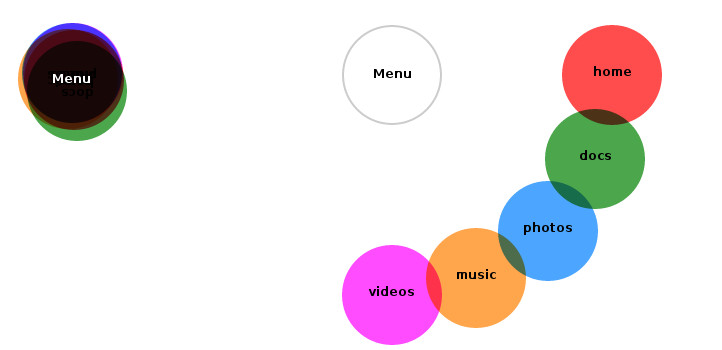
The overall effect is this:
I'm pleased with how it turned out, and although the total code is quite a bit more than the original example, it is far more flexible, and removes the reliance on JavaScript, which is something I think should be avoided where it can if it doesn't create an inappropriate amount of work to do so.
Comments