
Tags:
The proposed changes to the Web Content Accessibility Group (WCAG) guidelines defined in the WCAG 2.2 working draft are aimed at improving the experience for people with cognitive disabilities and low vision, as well as improving the overall experience for those using mobile devices. This is meant to be an interim set of guidelines until WCAG 3.0 is completed.
There are 9 new guidelines that tie in with general accessibility advice found across the web, including a couple that tie in with 2.4.7 Focus Visible to determine just how visible the focus indicator should be.
Contents
Focus Appearance (Minimum)
- Level
- AA
- Guideline Link
- 2.4.11 Focus Appearance (Minimum)
All interactive elements on the page that can receive focus (e.g. buttons, links, form controls) should have a visible focus that meets the following criteria:
- The focus indicator contrasts with a ratio of at least 3:1 with the unfocused colour of the component.
- The focus indicator should contrast with adjacent colours with a ratio of at lesat 3:1 or is at least 2px wide
- It should either be:
- An outline of the whole component of at least 1px
- Or is at least a 2px line whose surface area exceeds the outline area of the component minus 4px
- The indicator is not fully obscured by other content on the page
Focus Component Contrast
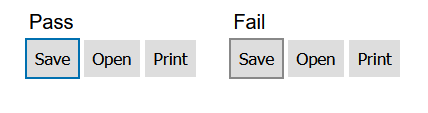
The passing button uses a 2px solid border with the colour #0070b0 which contrasts well against the button background colour of the button (#dfdfdf). The second set of buttons fails, because the colour #888 fails the minimum contrast ratio of 3:1 with the button.
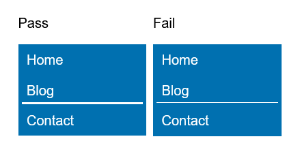
Focus Adjacent Contrast
If the focus style is shown with an outline or gradient/shadow, then the colour of that also needs to contrast with the surroundings (typically the background of the containing element) at a ratio of 3:1 as well.

Here, the background is set to a dark grey (#222) and the previous focus border colour (#0070b0) fails because it just doesn't contrast well enough. Instead, a red border (#f00) provides a ratio of more than 3:1 for both the button and the background, making it suffficient as a focus border colour.
Focus Size
This part is a little trickier to explain, and the draft specification certainly doesn't make it immediately obvious. Firstly, if the focus indicator is a solid (not dotted or dashed) outline surrounding the entire component (as the previous border example were), then that is sufficient to pass the focus size check. However, if the style of the indicator is something else (like a partial border, drop shadow, etc) then it needs to be checked that it satisfies the size check.
Consider a side navigation menu on a website where each link is a 150×36px block. The surface area requirement is based on the size of the outside perimeter of the shape of the object that is showing a focus style. In this case, that perimeter is 372px. The surface area of our focus indicator needs to be an area that is at least 372px - 4px (368px in this case).
Here the focus style is not the full width, being on 142px wide. A single pixel border fails because it totals an area of 142px². The passing style uses a 3px high border, which gives a total surface area of 426px².
For this simple example, the surface area was fairly simple to calculate, but for more complex shapes it can be very tricky. The WCAG has more in-depth examples on how to meet the focus size criteria.
One point worth mentioning is that for gradients (like drop shadows) only the parts that meet the contrast requirement of 3:1 count towards the surface area. The WCAG advises to take spot checks of various points within the shadow to get an idea of the surface area of the shadow that contrasts well enough.
Focus Appearance (Enhanced)
- Level
- AAA
- Guideline Link
- 2.4.12 Focus Appearance (Enhanced)
This one is much the same as Focus Appearance Minimum with the exception of two key parts:
- The contrast ratio for all parts changes from 3:1 to 4.5:1, as we are used to for text contrast.
- The contrasting area needs to be at least double the perimeter of the focused element. So, in the case of a 150×36px link box, the focus indicator contrast area needs to be at least 744px².
With the contrasting area requirements, outline borders would need to be at least 2px thick, and partial borders would need to be much larger. However, changing the entire background would be perfectly acceptable as long as it contrasts well enough with the original unfocused state and any hover state the element might have.
Page Break Navigation
- Level
- A
- Guideline Link
- 2.4.13 Page Break Navigation
This applies to paged media, which are less common with websites. If a website does use pages (e.g. forced page breaks with the CSS break-after property), then it should also offer a way to navigate to these pages more easily.
So, for example, a web page which uses forced page breaks with break-after: page; could have anchor points that occur after the break, and then an accompanying navigation that contains links to point to these anchors:
<nav role="doc-pagelist" aria-labelledby="pglist">
  <h2 id="pglist">Page List</h2>
  <ol>
    <li><a href="intro.html#pg1">1</a></li>
    <li><a href="intro.html#pg2">2</a></li>
    …
  </ol>
</nav>
Taken from example 1 of page list navigation techniques
Dragging Movements
- Level
- AA
- Guideline Link
- 2.5.7 Dragging Movements
Any user action which relies on dragging the pointer (e.g. click and moving the mouse before release) should offer an alternative method, such as via the keyboard.
For example:
- A drag and drop interface for uploading files could offer a button to open the standard browser upload interface.
- A list which allows a user to sort items via clicking and moving them should provide an alternative that doesn't rely on a pointer device.
- An interface which allows the user to resize components by clicking on their resize handles and dragging could allow a user to resize to some one of a few preset sizes via a keyboard shortcut.
Exceptions to this are interfaces where the dragging motion is essential, such as a game or drawing screen.
Target Size (Minimum)
- Level
- AA
- Guideline Link
- 2.5.8 Target Size (Minimum)
This is one that is sure to get digital advertisers the world over mad! The idea is that interactive elements should be able to be triggered without the user accidentally triggering a neighbouring element. For example, a small close button for an advert where the entire advert is also a link to a product page would fail, as these are the most often mis-clicked things in the history of mis-clicked things!
Interactive elements should be at least 24px in size, or if the target is smaller than that, requires spacing from surrounding interactive elements that brings it up to a total of 24px. So, a button that was only 16px×16px would need a further 8px of space on all sides from other interactive elements.
There are exceptions:
- If the spacing is essential, such as pins on a map
- If the interactive element is a text link within a paragraph of text.
To go with this new guideline, the existing 2.5.5 Target Size has been changed to 2.5.5 Target Size (Enhanced), which stipulates a larger target size. It does not appear that the enhanced guideline has any change to account for spacing of interactive elements when the target size is below its 44px threshold.
Consistent Help
- Level
- A
- Guideline Link
- 3.2.6 Consistent Help
Help comes in many forms on the web. It could be something as complicated as a contextual interface providing realtime advice on an interface that follows the users focus, or something as simple as a contact number for the company.
Where this help is provided (there's no absolute requirement that it must be, although it's highly recommended for the benefit of all users) it should be offered in a consistent manner:
- The location of contact details/links should remain in the same location throughout the set of pages, e.g. a blog might put the details in the footer, while a corporate website might have a contact page link present in the main page navigation bar in the header.
- Error messages for a form field should use the same terminology as the visible field name. So, an error for a field marked 'mobile phone number' should refer to it by this name, and not just 'phone number'. This may be especially important if there are more than one phone number fields present in a form.
- A payment field requesting the card verification number (CVV or CVC) could provide a contextual help button or link that provides further details to where a user might find this and which numbers they need to type. This would make the help consistent with other similar payment forms found across the web, so the user will be able to more easily find what they need.
Visible Controls
- Level
- AA
- Guideline Link
- 3.2.7 Visible Controls
All interactive components on a page/site should be visible, or have a visible trigger, and not rely on hover or keyboard focus of something to become visible. There are exceptions for the following situations:
- The elements being hidden is essential, such as hiding the controls of a video player in full screen mode, where showing the controls permanently would be disruptive to the playback of the video.
- The component exists only to enhance the experience for keyboard navigation, like skip to content links which are visibly hidden until they recieve focus.
- The controls can be set to be persistently shown, like an advanced settings panel that can be toggled on and off via another control.
- The hidden component can be identified by another control on the same page, such as a sub-menu that is traditionally shown via keyboard focus or mouse hover.
So, an interactive component like a file list might have some associated controls to manage a file (like copy, move, delete actions). To satisfy 3.2.7 these controls can be:
- Permanently visible as actions on each file
- Available via a menu trigger, such as a hamburger (☰) or kebab (︙) menu trigger.
- Shown only when the file is selected via its corresponding checkbox
Accessible Authentication
- Level
- A
- Guideline Link
- Success criterion 3.3.7 Accessible Authentication
This seems fairly simple on the surface, but actually covers quite a few things. At its core, it's about removing some of the heavy thinking from the authentication process. A few things it recommends are:
- Allowing password managers on login forms. With more and more services enforcing stronger and more complex passwords, everyone will benefit from this
- Allow copy/paste throughout all parts of an authentication process. For example, let a user paste into a password field, or copy an authentication key in the event of setting up multi-factor authentication.
- Captchas must have an alternative that does not rely on a cognitive component, such as:
- Object recognition. A fire hydrant or a taxi might not be well recognised, especially to those people outside the culture and locale to which the images belong.
- Reliance on a memory element, such as the text alternative audio for people with visual disabilities. Anyone who has problems remembering a completely random string of letters, numbers, and symbols spoken out to them (often in a way that does not let them control the speed) will benefit from an alternative to this.
- Completing a calculation or similar. These can be especially difficult for people suffering from Dyscalculia.
Redundant Entry
- Level
- A
- Guideline Link
- 3.3.8 Redundant Entry
This is about reducing the need for a user to re-enter information into a system where that system already knows this, unless it's essential to the task at hand.
For example, the search function of a website can pre-populate the same search field on the results page. This removes the need for that user to remember their exact search if they need to refine the results. Doing this benefits all users, and not just those who might have short term memory issues.
Exceptions to this would be things like an authentication process, or the confirmation of a new password that might not allow a person to review before submitting a form.
Conclusion
The new guidelines are a welcome additon to WCAG before their next major overhaul which will become WCAG 3.0, but that may still be some years away from moving out of draft status.
Comments