
Tags:
WAI-ARIA (Web Accessibility Initiative - Accessible Rich Internet Applications), or ARIA for short, is a way of adding further accessibility to elements that you cannot by using HTML alone. Most usually it's used to add a label to something that assistive technology (such as screen readers) can access and present to the user, where the existing text inside the HTML is lacking or would be confusing.
Contents
What Is ARIA?
To explain what ARIA is, I need to give a little more history on the accessibility efforts of HTML alone.
Back in the mid 90's Internet Explorer was the dominant browser, and was pushing forward with the idea of web technology that could be used to create rich web interfaces and applications. They introduced a new language called VBScript that worked much the same as JavaScript, but only in IE, which they also intended as a language that could run on both server, client, and within their own Microsoft software as well.
HTML back then was fairly basic, consisting of only a handful of the 100+ tags we have today, but 2 new tags became fast favourites with many developers because they were effectively blank slates: <div> and <span>. One was for block level elements, the other for inline elements (CSS at this time was also very basic, and changing the display type of an element was poorly supported and had some interesting bugs.)
However, the very thing that made these new elements appealing was also their biggest problem: they had no inherent semantics. Even <b> and <i> had some loose semantics, that _could_ be used to determine some way of differentiating their content in a specific way from that of their neighbours. A <div> though, had nothing. It was just a simple wrapper that could be styled fairly consistently without trying to override various defaults by different browsers.
In 2008 a working draft of the WAI-ARIA spec was proposed that was heavily focused around web applications. Among some of the things it proposed, there were:
- Support for roles, a feature that is still key today.
- Ways to manage focus for sub-components, such as grids and lists.
- The concept of relationships between items.
- States of elements, such as expanded.
However, it wasn't until about 10 years ago that browsers actually started supporting it. By that time, many semantic elements in HTML had had browser support for about 5 years or so. But, ARIA still had a purpose to serve. There were still gaps between what HTML offered, and what developers wanted to build. Also, while some elements in HTML worked functionally, they lacked the ability to be styled visually as developers wanted. That obviously led devs to re-create their own prettier wheels, which unfortunately lacked any semantics, as they were largely based around <div> tags!
What Does ARIA Offer?
The 3 main features that ARIA offers today are:
- Roles for elements, and the ability to override existing roles and change them to something else entirely.
- States, such as expanded, disabled, etc.
- Properties, such as labels, relations to other elements, and some validation rules for form fields.
ARIA Roles
Every element in HTML has an inherent role, that essentially describes what _type_ of element it is. There are 2 types of roles, inherent and given, which are distributed among 6 main categories:
- Document structure. The majority of these will come from the HTML tag that was originall used, e.g.
list,listitem,row,cell, etc. - Widget roles are for complex interactive components, such as
slider,spinner,tab, andtreeitem. - Landmark roles define areas of the page that can be used to aid navigation. Roles here include
region,navigation, andform. These roles should ideally inherit from their HTML tag rather than be explicitly set. - Live regions are used to indicate that elements content will be expected to change, allowing screen readers to keep the user updated in a sensible manner. These include
timer,status, andalert. - Window roles are typically for modals that block normal content flow until they're dismissed, like
dialogandalertdialog. - Finally, abstract roles are reserved for interal use by the browser itself, and are not for content authors and developers to use, as they will have no affect.
How To Use Roles
One of the most useful applications I've found for ARIA roles is to work around a bug when using an SVG (Scaleable Vector Graphic) image inside an <img> tag. If someone is using VoiceOver they may encounter a bug with older versions of Safari, where the screen reader ignores the image completely. The fix is to add role="img":
<img src="/path/to/svg/file.svg" alt="ACME Logo" role="img"/>
As mentioned previously, you should avoid using roles where native HTML will give you the same effect. So, this <div> soup:
<div role="heading">Lovely Heading</div>
<div role="button">Fancy button</div>
<div role="list">
  <div role="listitem">Item 1</div>
  <div role="listitem">Item 2</div>
  <div role="listitem>Item 3</div>
</div>
Becomes this instead:
<h2>Lovely Heading</h2>
<button>Fancy button</button>
<ol>
  <li>Item 1</li>
  <li>Item 2</li>
  <li>Item 3</li>
</ol>
It's cleaner and easier to read, far easier to maintain, and you'll get all the benefits of native semantic support out of the box. Plus, for interactive elements, like buttons, you don't have to add in all the Javascript and CSS to get this to behave like a native button.
ARIA States
States in ARIA are used in special cases to determine conditions of the element. Most typically you'd see them associated with interactive elements, or elements associated with interactive ones, such as menus.
Common states are things like aria-checked, aria-selected, aria-expanded, and aria-pressed.
How To Use States
Consider a list of items, each of which has a checkbox associated with it, and one more at the top to allow an easy way to select/deselect all of them at once.
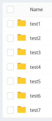
Now, imagine this scenario: You select all the files with the control checkbox. At this point, all of them are visibly checked. Then, you deselect a single file. What should the control checkbox look like now? It shouldn't be checked because not all the files are selected, but neither should it be completely unchecked because some files _are_ selected. Enter the 3rd state for checkboxes: indeterminate.
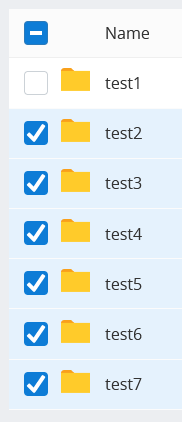
To reflect this state in ARIA, you use the aria-checked="mixed" state.
ARIA Properties
Finally, ARIA properties are used to provide a bit more information to an element, or alter the way that the element is presented to accessible tech. For example, you can add a more detailed description of an element by using aria-describedby to point to the contents of another element on the page, or you could add a label that will be used _instead_ of any other text content.
How To Use Properties
A frequent use I have for ARIA properties is when building modal dialogs, as there is a need for detail that must be presented to the users, that must be available to people unable to see their screen.
<div
	class="modal"
    role="dialog"
    aria-labelledby="share_heading"
    aria-describedby="share_description"
>
	<h2 id="share_heading">Share Photo</h2>
    <p id="share_description">
    	Where would you like to share your photo to?
    </p>
</div>
How To Test Your ARIA Code
I find one of the best ways to really test my code is to actually use a screen reader. There are plenty of choices for most operating systems, although you're stuck to using VoiceOver on Apple devices/computers, and Narrator on Windows 11S. Personally, I use NVDA on Windows, which is free, and the most popular after JAWS, which is paid. However, if you can, do try to test across several, as each one has its own subtle differences. Whatever your choice of reader, it's best to have a read through the help section to get familiar with some of the typical shortcuts and ways to navigate.
If you're unable to test a screen reader, or just don't want to, have a look at the accessibility tree in the browser itself. This tree should look fairly familiar, as it will be very similar to the DOM tree from which it's built.
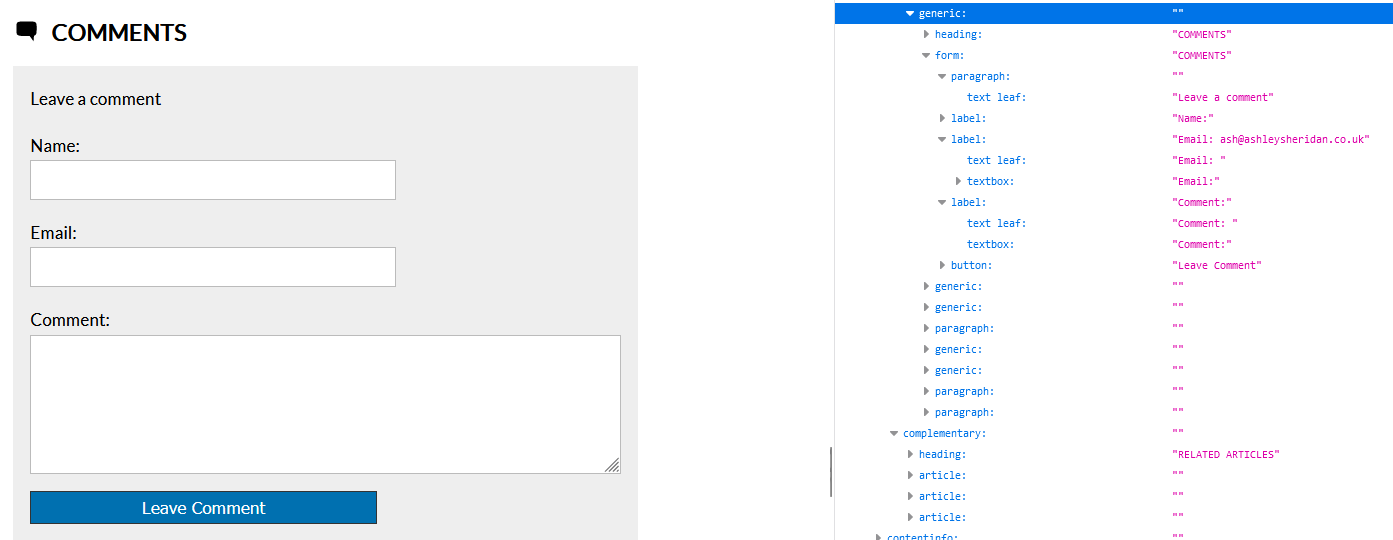
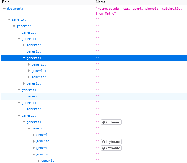
What you should expect to see is a series of logical roles used to corresponding key elements on the page, such as headings, forms, buttons, checkboxes, etc. What you should absolutely avoid is an accessibility tree that is just a large tree of "generic" elements:
Basic Screen Reader Navigation
It should be obvious that you should ensure your content can be easily navigated by tabbing through it. This should move focus in order to each element that is either interactive or has been explicitly identified as one that can be focused on (with the tabindex attribute). By default, your screen reader will then proceed to speak out content from that point.
Firefox offers a great way to see the default tabbing order of a page with its built-in accessibility tools. If you open up the accessibility panel in your developer tools, and tick the checkbox marked "Show Tabbing Order", you should see numerical identifiers next to the focusable parts of your page:
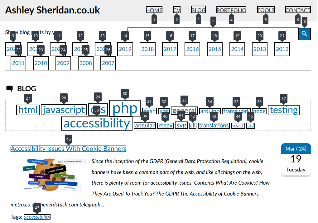
From there, each screen reader will behave a little differently, but they typically all offer ways to jump across words, sentences, paragraphs, and other key features on the page, such as key landmark areas of the page.
Here are some guides for the most popular screen readers:
- NVDA keyboard shortcuts
- JAWS keyboard shortcuts
- VoiceOver keyboard shortcuts
- Narrator keyboard shortcuts
- Orca keyboard shortcuts
Conclusion
HTML today gives you a lot more control in how you present your content the in the best way. With more than 100 tags you shouldn't really need to rely on <div> and <span> tags. The situation isn't perfect, which is where ARIA comes in, but you should always remember the golden rule of ARIA:
Only use ARIA when you must, and avoid using it wherever possible.
Comments