Tags:
Browsers today are very different beasts than they were a decade ago, and come with some amazing tools for developers to help them work more quickly and efficiently. I want to introduce you to the accessibility tools built into Firefox.
Contents
- Detecting Issues Automatically
- Simulating Colour Blindness
- Viewing Tab Order
- How do the Firefox Accessibility Tools Compare?
Accessing the Tools
The accessibility tools are in a tab inside of the browser developer tools, which is accessed by pressing the F12 key (Windows and Linux) or Cmd + Opt + I (Mac, where simple tasks are often hidden behind difficult to remember keyboard shortcuts!) Once open, you can re-order your developer tool tabs as you see fit, bringing those you use most frequently to the beginning of the list.
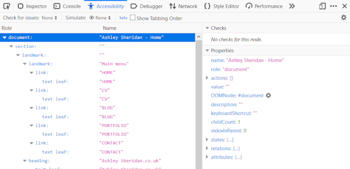
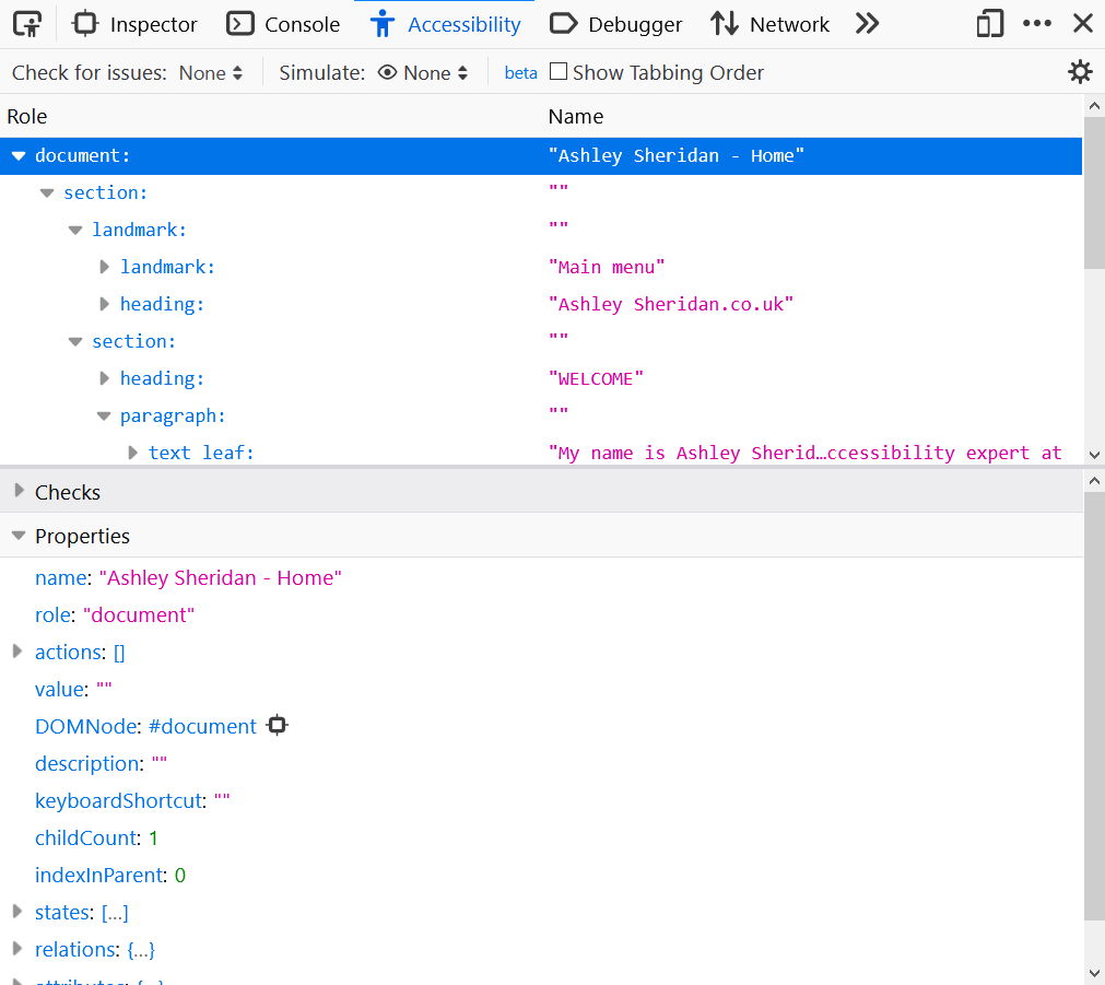
The Accessibility inspector initially shows the accessibility tree for the web page you're on. This is similar to the DOM (Document Object Model), and indicates how assistive tech (like a screen reader, for example) will present your content. Each node in this tree view can be selected to show the properties of it, such as its accessible name, the type, states (especially useful for interactive nodes, like links, etc) and a direct link to the DOM node that best matches the accessibility tree node (there's not always a 1:1 correlation between the two).
At the top of this developer tools panels are 3 main options which are:
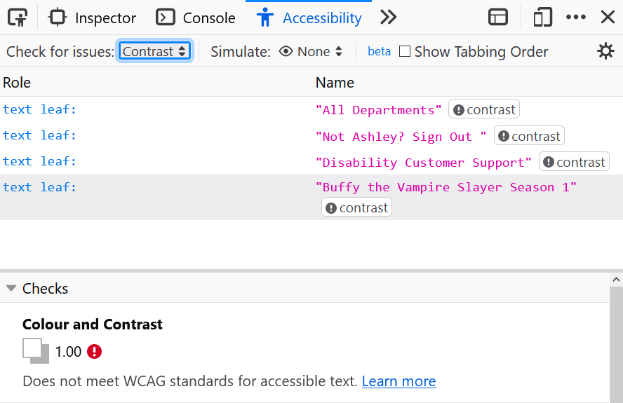
Detecting Issues Automatically
The one thing I love about the automated checking tool in Firefox is that it doesn't need to refresh the page (looking at you Chrome Lighthouse), which is especially beneficial when working on complicated web apps where user input changes the state of the application, affecting what's available on screen to test. The issuer checker looks for 3 main problems, which you can either opt to test for all at once, or you can specify one thing to focus on only.Colour Contrast
Colour contrast is based on the AA WCAG 2.1 requirement rather than the harder to achieve AAA. Text meets colour contrast requirements if:- It has a contrast ratio of 4.5:1, or
- It has a contrast ratio of 3:1 and
- The text is bold and at least 18.66px, or
- The text is at least 24px
I've avoided specifying point (pt) sizes here, as they don't make much sense on the Web where there is such a mixed pixel density across screens, as points are a unit of measurement that relate to an inch, and are inconsistent in web browsers.
Keyboard Accessibility
The keyboard check looks for elements that have specific actions or behaviours triggered from mouse clicks which wouldn't otherwise recieve input from keyboard presses. This might be because an element isn't even able to receive focus from the keyboard (via tabbing, for example) or it can't process a click event with a typical keyboard key (like Enter), because the element isn't set up to handle certain key presses.
Sometimes this might throw up false positives, for example you have nested elements and have added Javascript click event handlers to both to work around a bug. There wouldn't be a need to allow focus to move to the inner element and so there isn't a need to handle keyboard presses on that element.
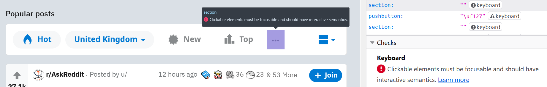
One thing to note with this test is that screen readers (among other plugins) might interfere with the default keyboard behaviour. Some screen readers detect the Enter key on an element with only a mouse click event handler and trigger the mouse click event. For this reason, it's always good to test keyboard access both without and then with a screen reader, as the experience of the user may differ.
Text Labels
Text labels are one of the core tenets of web accessibility, and are at the heart of more than one WCAG guideline. The simple explanation of this check in Firefox is to ensure that all elements which should have a text equivalent actually do have one. This covers everything from images without alt text, SVGs with no text equivalent (e.g. via ARIA), through to interactive elements like buttons and text boxes without a or text value.
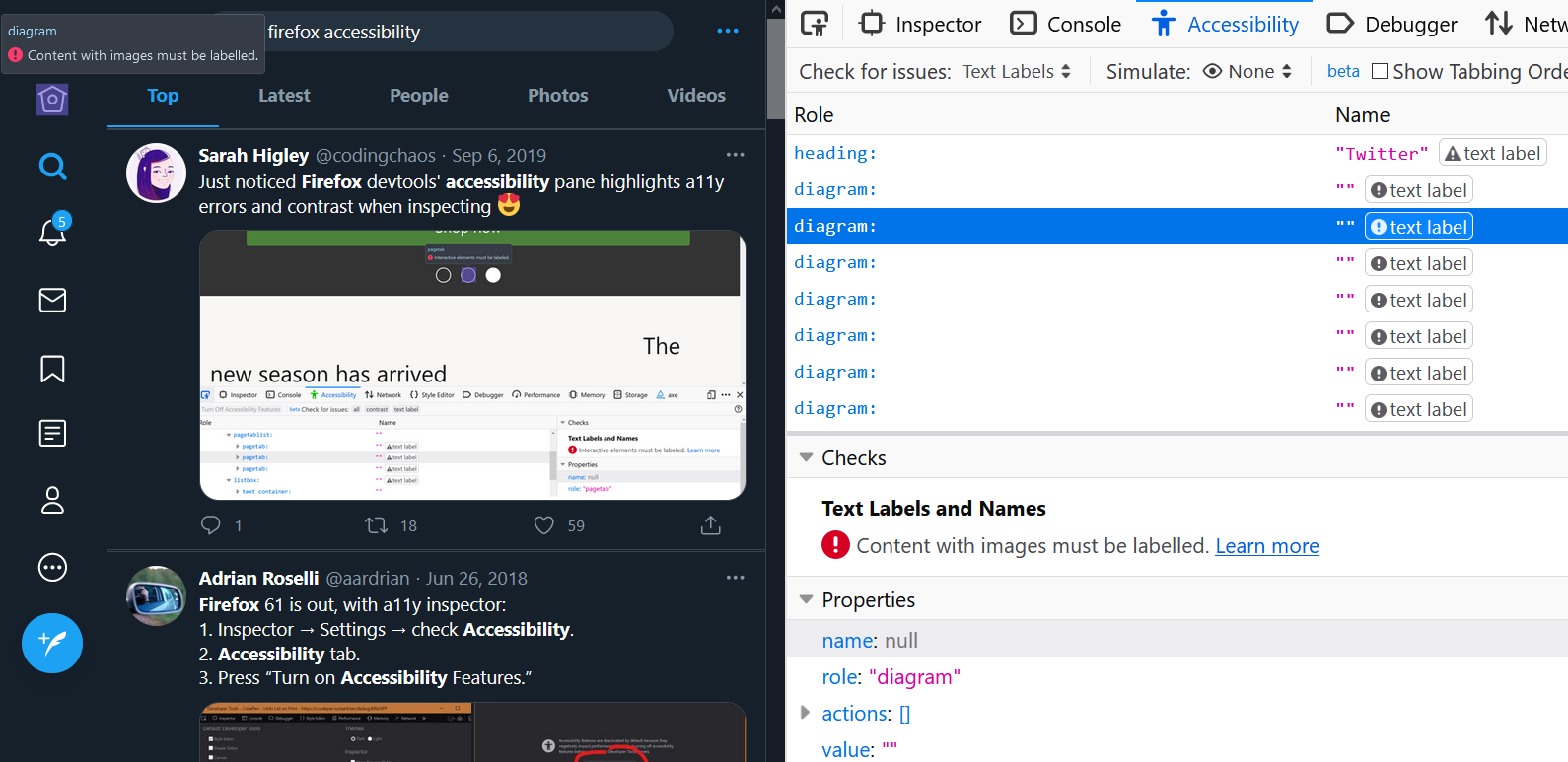
If you're using a similar method to Twitter to add icons to navigational elements, ensure that your icons are given proper text labels with alt or aria-label. If your links already contain an accessible label, you could consider hiding the icon from screen readers (and equivalent) using aria-hidden.
Simulating Colour Blindness
The colour blindness simulator can help to give you an idea of how someone might perceive your website. Everyone perceives colour differently, so what you see under a given filter is not necessarily how everyone with that form of colour blindness will see. It does open a door though, and lets you check for obvious parts of your website which can't be used because of it relies on colour.
For example, a status page that uses only traffic light colour indicators to highlight whether something is good, or has errors would fail for people who couldn't distinguish those colours apart easily. You will likely easily notice this when testing under a colour filter. Again, these filters are just hints, they are just meant to visually emphasise that colour alone shouldn't be used as an indicator.
Viewing Tab Order
The tab order tool in Firefox is a little different from other similar tools in that it places a small number next to each element that can recieve focus, instead of drawing a line from each focusable element.
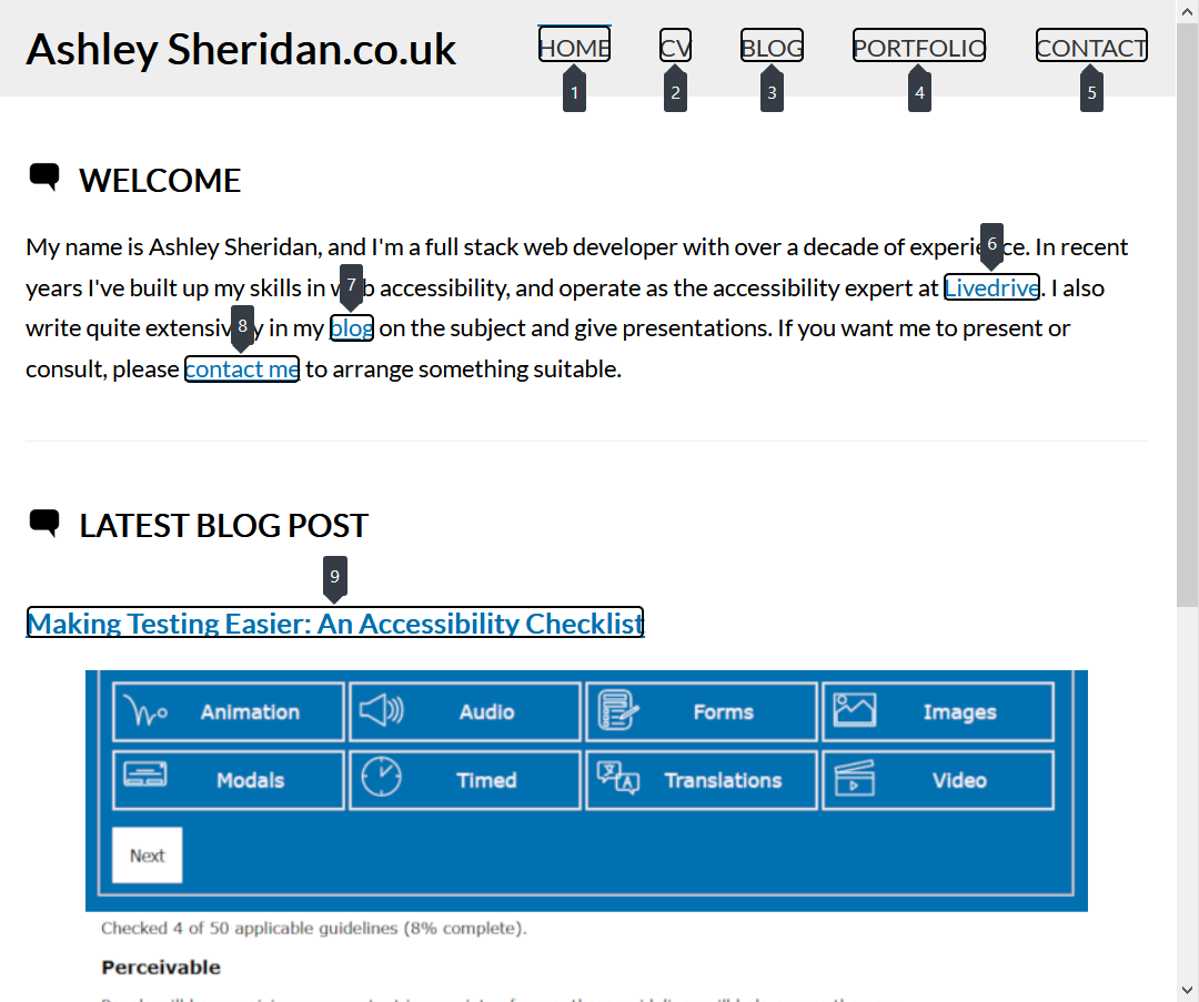
It should be noted here that, like the other inspector tools, this operates on what is available on the screen at the moment the check is performed. This means that you need to trigger modals and menus to open to test their tabbing order in situ.
Why is Tab Order Important?
If you're using a mouse (or other pointing device, like a touchpad or touchscreen) to navigate, then you have a cursor which you can move to any point of the page. If you're using a keyboard (or equivalent) to navigate though, you're tied into linear movements, cycling though focusable elements in order.
When the focus order of elements doesn't match the order that things are shown on screen, it creates a disconnect for the user. Imagine tabbing through a navigation bar and seeing your focus move the wrong way across the links? This is particularly a problem when a website uses CSS that changes the visual order of content. The best way to avoid this is to be careful how you use the following CSS:
float: left|right;- CSS Grid with any of the following additional properties:
order:grid-template-areas:grid-auto-flow: dense;grid-row-start:grid-row-end:grid-column-start:grid-column-end:grid-roworgrid-columnshorthand properties that changes the order
flex-directionwith any value that differs from the current language default
If you absolutely do need to do this on focusable elements, then see if it's possible to also adjust the tabindex order in the source HTML as well, so that both are consistent. This might not always be possible given the nature of CSS being applied differently based on media queries.
How do the Firefox Accessibility Tools Compare?
The accessibility tools in Firefox are always my go-to for first round of testing. They help to check for more things than any other browsers built-in tools, and they don't refresh my page so any actions I take which alter the page are also covered in the test.
| Tool | Firefox Inspector | Lighthouse | Axe | Wave |
|---|---|---|---|---|
| Built-in? | Yes | Yes | No | No |
| Cross browser? | No | No | Yes | Yes |
| Refreshes page? | No | Yes | No | No |
| Interface usability | Simple | Simple | Slightly complicated | Simple but busy |
| Test range | Detailed | Basic | Very detailed | Very detailed |
| Colour blindness simulator? | Yes | Yes | No | No |
| Quantifiable error scores? | No | Yes | Yes | Yes |
| Available as CLI tool? | No | Yes | Yes | Yes |
As you can see, while the Firefox Accessibility Inspector isn't as comprehensive as tools like Wave or Axe, it does still work well, and is immediately available because it's built in. It is more capable than other built-in tools, but it doesn't polish its error output quite as well as Lighthouse.
Another area it fails on is the availability of a command line interface to make it part of an automated build pipeline. Chrome's Lighthouse does do this, but as that is based on Axe anyway, and as it doesn't offer the same number of tests that the most recent version of Axe does, I would always recommend going with Wave or Axe specifically for CLI testing.
Comments